Saturday 30 September 2017

The Problem with BioShock

Note: the following piece contains violent images

It wouldn't be a stretch to say that 2007's BioShock is one of the most acclaimed video games ever created. Look at the top games section at your typical review outlet, and there's a strong chance that BioShock will be near the top of the list (alongside its second sequel BioShock Infinite, not so much the sadly overlooked BioShock 2). Most people I've spoken to who have played it have nothing but glowing praise for this modern classic. In the eyes of most critics and players then, BioShock is an indisputable artistic achievement for video games; a landmark in the medium.
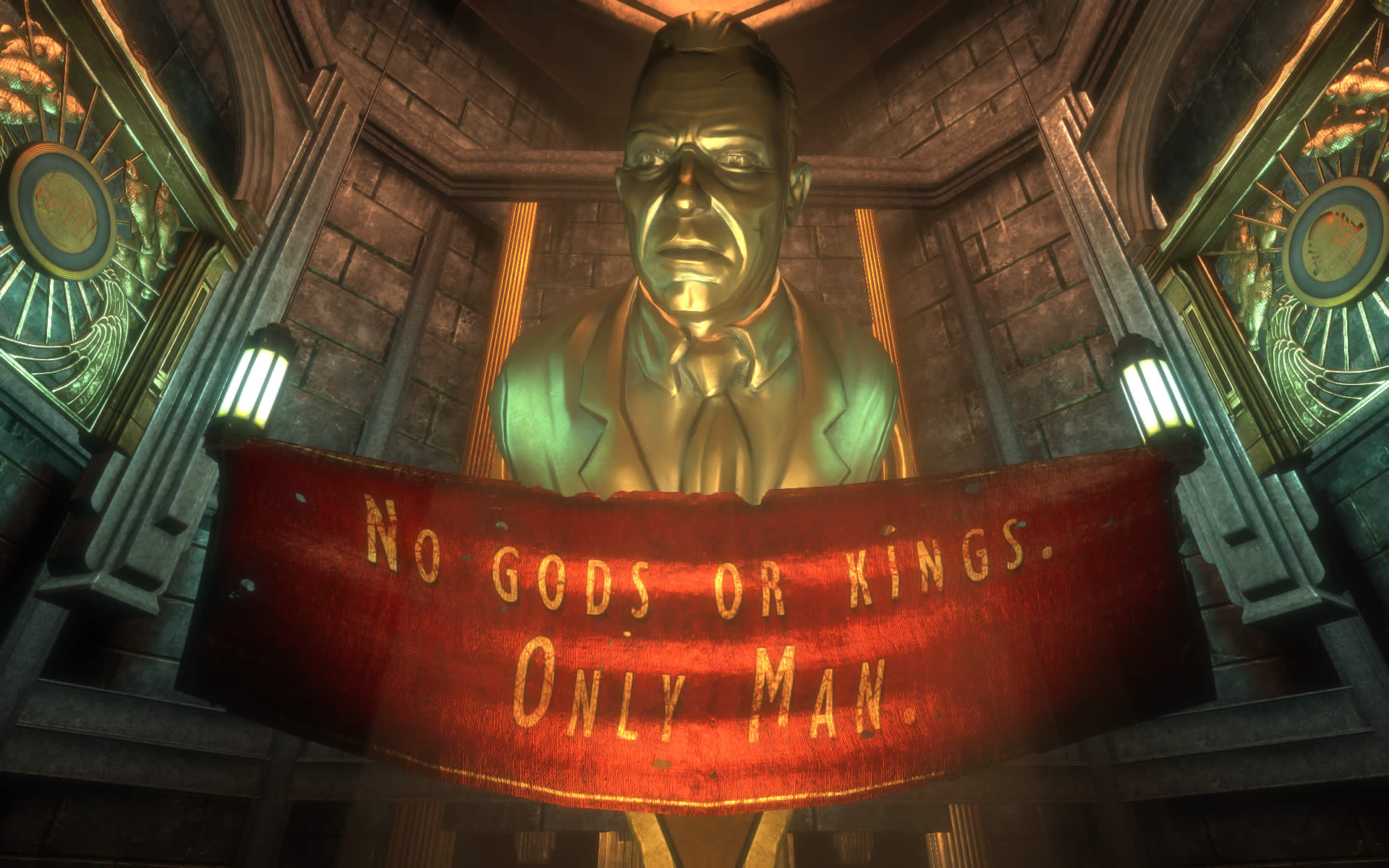

Yet I myself have often struggled to love this game as much as others do. I don't consider it to be an outright bad game, but I was never particularly enamoured with it either. There are a number of reasons for this: the simplified gameplay compared to its System Shock predecessors; a moral choice system that reduces the player's decisions to mere mechanical evaluations; and an ending that deflates any impact the story may have had in an anticlimactic fizzle. These are all common criticisms, but there's one other flaw in BioShock that, for me, adversely affects the gameplay experience and how the player perceives the virtual world around them - looting.

On the surface level, the presence of looting in BioShock makes a great deal of sense - you are, after all, trying to survive in a crumbling underwater city where the crazed former denizens will be waiting around every corner to get the drop on you. So it seems reasonable that you'd want to make exploration a central activity for the player; to scavenge for every resource you can find. For me though, BioShock's approach to exploration and looting is actually a detriment to its story and setting. Because the general gameplay has the player focusing on gathering resources, they also tend to stop paying close attention to the world itself. As far as the player is concerned, subconsciously or not, the world is just one giant loot crate.

That's pretty gruesome...better loot him for ammo and not think twice about it, the game certainly won't

Think of this another way - when the player comes to a room which is strewn with dead bodies, then the story will obviously be expecting the player to be disturbed by the sight, as one should be. Indeed, the BioShock games frequently make use of bloody images that, taken on their own, would look shocking to the casual observer. But the gameplay portion of BioShock contradicts this expected shock value, because the player will be encouraged to instead loot every body they can find for health kits and scraps of ammo before continuing on their way. This certainly isn't helped by the fact that BioShock seldom quietens down long enough for the player to absorb the world around them - the action is so frequent and 'shouty' that the player isn't really given time to appreciate the atmosphere or ambiance of the setting.

This extends into every part of the environment - the gameplay doesn't encourage you to take in your surroundings or think about the sights you're seeing, instead you're merely encouraged to mash the use key at every container-like object in the room before following the floating arrow to your next objective. There is a brilliantly realised world in BioShock - a steampunk underwater city full of dark intrigue and art deco idealism gone terribly wrong. There's also a pretty good story here, which has already been analysed frequently in other columns, so I won't repeat any of the major beats here. Yet it all seems to be in service of a game where your primary objective is to kill, loot and repeat, with occasion button-prompted moral choices that are about as nuanced as the colours on a chess board.

I'm certainly not arguing that BioShock is bad; the gameplay itself still makes for a fun experience and offers enough flexibility to make each playthrough an interesting one. At the same time, I can't help but shake the feeling that the gameplay is also responsible for diminishing both the story and the setting. The term "ludo-narrative dissonance" is often used to describe a conflict in game design where the actions of the player during gameplay don't line up with the character's actions within the context of the story1. Although not a term I typically use, it could easily apply to BioShock in this respect - the story expects you to think and feel horror at the cruel depths of extreme human idealism you're witnessing; but the gameplay just expects you to shoot, loot and keep moving. This becomes even more painfully obvious in BioShock Infinite, where the gameplay is further watered down in favour of becoming a stock shooter in service of an even more pretentious hole-ridden story. The dissonance is even more noticeable here, as there's little context in Infinite's narrative that can explain any of the core gameplay mechanics or why they exist. It's part of the reason BioShock Infinite is so gratuitously, pointlessly violent.

This isn't a problem limited to BioShock, but I would still argue that this kind of fast-paced kleptomaniac approach to exploration is often counter-intuitive from a storytelling perspective. Slower-paced games such as Thief or Deus Ex solve this problem be requiring the player to carefully analyse their surroundings to find key items, going beyond merely exploring nooks-and-crannies towards players building a detailed mind-map of their surroundings. Indeed, the levels in the older Thief games could be viewed as being giant self-contained puzzle boxes that required the player to see them primarily as being authentic believable locations that fit together under internal logic rather than merely as a linear succession of challenges to be overcome. The levels in these 'immersive sim' games are designed first and foremost to feel like believable worlds built around player expression; the levels in BioShock mostly just feel player-orientated (or, for want of a better word, 'video-gamey'), robbed of its own internal logic2.

For me, this 'loot-crate' mentality is a major challenge to game designers - how can they encourage players to explore their environment without reducing the game itself to an elaborate collect-a-thon? Open-world games such as Far Cry or Assassin's Creed increasingly suffer from this looting obsession as well, where the focus is less on how the player can express themselves within a virtual world and more about giving people an overstuffed list of menial tasks to complete. With the exception of many 'im sim' games and some survival horror games, I don't feel any developer has completely cracked this problem. On the other hand, the recent resurgence of immersive simulators (as discussed by Games Workshop in this excellent video) gives me hope that developers will continue to explore the manner in which players see the virtual space around them. Perhaps soon, we'll be able to look past the next loot box and instead see the world beyond.


References:

1 The term was actually coined in relation to BioShock by Clint Hocking, you can read the original piece here: http://clicknothing.typepad.com/click_nothing/2007/10/ludonarrative-d.html

2 For one thing, why do the revival chambers in this game only affect the player? At least in System Shock 2, the player needed to actually find them first.

Saturday 8 April 2017

Thoughts on Dear Esther

The following review is based on my latest playthrough of the Landmark Edition of Dear Esther - contains minor spoilers from the first third of the game.


File:Dewiki c1 thelighthouse.jpg

Dear Esther is beautifully rendered, hauntingly atmospheric and splendidly narrated. It also has a couple of very big problems.

The Old Argument


But the question of whether or not Dear Esther is a proper game isn't one that's ever bothered me. Gaming is still a relatively young medium, open to change and experimentation. For me, dismissing a game solely on the basis that it doesn't fit into the traditional definition as being one is an attitude that can only stifle innovation and discourage other developers from trying new ideas. Indeed, games such as The Stanley Parable have demonstrated the advantages of such a minimalist approach. The more interesting question for me is: did Dear Esther succeed in what it set out to do? In this review, I'll attempt to pin down my thoughts on where I thought the game excelled, and where it faltered.

Dear Esther is one of the original "walking simulator" titles (having very little gameplay beyond walking and looking around) set on a bleak Hebridian island and played from a first-person perspective. The island is nothing short of breathtaking, and is perhaps the highlight of the entire experience. I've visited these islands in real life, and Dear Esther succeeds magnificently in capturing their cold yet beautiful atmosphere. The cliffs feel as ancient and wind-scoured as their real-life counterparts and the faint rustling heard from the forlorn plant-life seems to reflect the equally forlorn themes that underline the game's story. The visual and sound design are both spot-on in establishing the sights and sounds of the Western Isles, which in turn is helped by the superb soundtrack. It was during the story's foray into the caves beneath the island that Dear Esther truly pulls out all the stops - there were some parts in this section that left me literally stunned at what I was seeing (and hearing) in front of me, to the point where I had to stand still for a couple of minutes just to soak it all in. That's a rare achievement for any video game.

You play as a nameless, voiceless, faceless protagonist shipwrecked on a harsh Scottish island, who sets out towards the radio tower on the horizon. It's not immediately made clear what you intend to do once you get there, but by keeping the tower in sight while wandering through the outdoor sections, the player never feels lost or in doubt as to which way to go. As a way of guiding the player through the levels and preventing accidental backtracking, the radio mast works well when serving this purpose, in a similar manner that the mountain does in Journey. Interaction is limited to walking around the island and sometimes poking your head into decrepit buildings, only to find them empty and long-abandoned. There are no puzzles to solve, people to speak to or choices to be made. Instead, the lion's share of the game is spent listening to a well-spoken narrator reading a series of letters written to the eponymous Esther. The narrator himself is another highlight of the game; adopting a solemn and subdued tone to start with, before rising to lurid and passionate speeches as you approach the game's climax.

It's hard for me to deny then, that the visuals, sound and voice acting are all nothing short of stellar. Unfortunately, Dear Esther also suffers from a handful of major problems that ultimately left me muted and underwhelmed by the game.

File:Dewiki c3 thecaves.jpg

Crux


Because of the limited interactivity and lack of gameplay, the narration pretty much forms the crux of the entire experience. Sadly, I found the quality of the writing in Dear Esther to be wanting.

If ever there was a walking definition of purple prose, this game would be it. Although the dialogue contains occasion flashes of brilliance, the core parts of the narrative are so cluttered with flowery twaddle that I found myself often being yanked out of the story thanks to the absurdly ludicrous delivery. I admit to not being particularly discerning when it comes to analyzing good writing, but I can usually get invested in a well-told story even if I don't fully understand it. But Dear Esther is so utterly pretentious and full of itself that I found myself getting frustrated rather than intrigued by the story. Here are a couple of quotes from the early game that I found particularly egregious:

"Dear Esther. I sometimes feel as if I’ve given birth to this island. Somewhere, between the longitude and latitude a split opened up and it beached remotely here. No matter how hard I correlate, it remains a singularity, an alpha point in my life that refuses all hypothesis."
- Opening monologue

"An imagined answerphone message. The tires are flat, the wheel spins loosely, and the brake fluid has run like ink over this map, staining the landmarks and rendering the coastline mute, compromised. Where you saw galaxies, I only saw bruises, cut into the cliff by my lack of sobriety."
- Level 2: The Buoy

Perhaps my experience with human speech is limited, but this sounds like it was written by a teenager in English class trying to sound far cleverer than he actually is (on this I can speak from experience, because it often sounds like reading one of my own high school essays). This is the only story I've experienced that somehow manages to be both frustratingly vague and tiresomely heavy-handed at the same time. I suspect this is down to the premise of the story being relatively simple and straightforward - a tale of loss, grief and despair that almost any person can relate to. Yet the writing actually manages to diminish any impact the game may have had by making itself so distracting and obtuse.

Then we come to the second major problem I have: the player. The fact that Dear Esther may not be a 'real' game isn't what bothers me. What does bother me is that the player is completely amputated from the story itself. We're not here to partake in a moving tale of human loss, instead we're merely treated as a vehicle for the narrator to force flowery nonsense down our throats without getting to influence or even really experience any of it. It might be more accurate to say that we're almost a hindrance to the game for our mere presence. This makes me wonder why Dear Esther is even a game in the first place, especially since it wrestles control from you during the ending (the only time something of note actually happens) and keeps your influence on the world as limited as possible. The only apparent benefit from it being in game form is the opportunity to hold down the W key for an hour, so it's essentially like watching a film on a DVD player with a broken pause button. On top of that, the walking speed is painfully slow:

"People need to be more patient and take their time with soaking in the atmosphere"

This is what admirers of the game often tell me when I say this. Fair enough, I like immersing myself in a slow-burner - if anything I prefer a story that takes its time to flesh out the central elements. But more often than not you'll wander down rather lengthy corridors, find nothing of interest, not even a bit of narration, and then have to slowly plod all the way back again. It's at these points that all the carefully planned pacing in the game comes to a crashing halt. Then there are other times when you have to traverse fairly featureless expanses of wasteland all the while sliding along at the average speed of a Peugeot driver on the Edinburgh bypass. This is not good pacing, this is just time wasting. Contrary to what the game seems to intend, this actually discouraged me from exploring the setting, as it seemed likely that doing so would only result in me wasting several more minutes of my time without any payoff, further reinforcing the feeling that the game was pushing against me as a player.

Final words...


File:Motorwayreferenceingame.jpg

Some people might say that I've simply missed the point of the game, and that I'm too thick or impatient to fully appreciate Dear Esther's story. In all honestly, there's a good chance that you're absolutely correct in saying that, given my poor taste for good writing. However, Dear Esther simply didn't engage me on any level, save for its breathtaking visuals. I never felt invested in any of the character shells we're given a vague description of, and its eagerness to be intellectual and thought-provoking just came across as pretentious and condescending.

The Walking Simulator genre isn't one without merit - The Stanley Parable is an excellent example of how the genre can be used to good effect. In that game, the actions of the player are what ultimately drive the narrative, resulting in an amusing and organic experience that is probably one of the best demonstrations of how choice in games can be used to craft a form of storytelling unique perhaps only to this medium (somewhat ironic considering that lack of choice is also one of The Stanley Parable's major themes). Not every game needs explicit player choices of course, but any game which places such a heavy focus on story needs to involve the player to some degree, and justify its place in the medium. Even a series such as Thief integrates its story well by making the actions of the player consistent with the main character, therefore placing both in the same mindset and helping immerse the player in the game's setting.

There's a real challenge for developers who want to tell a tale, but without the player being able to dilute its impact by performing actions that spoil its pacing or delivery. Instead of solving this problem with a different storytelling approach, The Chinese Room have resorted to effectively removing the player altogether to prevent them from interfering with the narrative. Their follow-up game, A Machine for Pigs, managed to make some leeway in improving on this by having the player take a more active role in the core events of the narrative. However, their more recent project Everybody's Gone to the Rapture seems to have once again regressed back to Dear Esther's more constrictive style without adding any new ideas of its own*.

At the end of the day, Dear Esther has a lot going for it - it has a compelling setting, fantastic visuals and a haunting soundtrack. For me though, despite its compulsion for walking, it won't go down in history as a step-forward for gaming as a whole.

*Note: I have not yet played Everybody's Gone to the Rapture, this comment is based on reading a number of reviews and watching some playthrough videos of the game. This seems fair judgement given what I've seen of the game.

Saturday 20 February 2016

Thoughts on Amnesia A Machine for Pigs

Amnesia: A Machine for Pigs [The Chinese Room/Frictional Games]
Amnesia: A Machine for Pigs is a first-person horror game developed by The Chinese Room as a sequel to Amnesia: The Dark Descent; one of the most infamous indie darlings of the past decade. But in my mind, it also functions as a spiritual sequel to their previous title, Dear Esther; one of the most controversial indie thingiemabobs of the past decade. One of my main issues with Dear Esther was its insistence on pushing the player away from any kind of agency or involvement in the story, which crippled it as a video game. This wasn't helped by dialogue that dripped with more purple prose than the Hebridian island's cliffs after a nearby dye-factory explosion. This is a crucial point, and I’ll explain why.

<Contains minor spoilers>

The premise of A Machine for Pigs, as you might expect, is not too dissimilar from The Dark Descent. You play as Oswald Mandus, an eccentric factory owner living in the smoky twilight days of Victorian London, just as the industrial revolution prepares to usher in a new era of technology and destruction. Indeed, it is this aspect of the setting that's carried over to the game's primary themes of greed, industrialization and corruption. Waking up in his mansion with no memory of the past few months, he is drawn deep into the bowels of the deathly-silent factories in pursuit of his children, who he senses are in mortal danger from some unknowable evil.


Speaking of smoky, what's with the blue tint?

If there’s one thing The Chinese Room are good at, it’s atmosphere, and A Machine for Pigs is as stellar as any of their other titles. The eponymous machine groans and rumbles in the belly of London, it’s steaming tendrils occasionally seen twisting up towards the surface, roaring like some kind of steampunk Lovecraftian monster gasping for air. It succeeds at bringing the machine across as being more of a living, breathing animal than an actual machine, which isn't too far off the machine's true identity. This isn’t mentioning the (also eponymous) pig creature enemies, who occasionally show up to squeal at you in a way that’ll make you regret ever using headphones for gaming. It’s effective at first, but a series of rather poor level design choices soon make you realize the lack of any real threat posed by these pork-pies.


Concept art.

The best way to summarize my feelings here would be to recount one of the encounters in detail. Around the middle of the game, I had just finished winding my way through a series of gangways that led into a fairly open factory floor. A shrill squeal behind me alerted me to the presence of a pig creature, although it’s location didn’t appear to make much sense given the geometry of the level (having appeared from the gangway I had just walked off). After a brief chase, I looked behind me only to find the piggy was barely moving faster than walking speed and hadn’t actually caught up with me. Every enemy encounter follows this formula, to the point that I no longer felt remotely threatened by anything else the game threw at me. The original Amnesia utilized these tightly scripted encounters as well, but also broke them up with moments of very real danger and difficulty, such as the Cellar Archives and the Choir. A Machine for Pigs has no such variety though, and enemies later became more of minor nuisance than a threat.


Moody, but rather linear.

This poor level design also carries across to a key change The Chinese Room made to Frictional’s style that I found so utterly contrived and moronic that it grated on me constantly throughout the entire runtime. In the original Amnesia and Penumbra games, Frictional made use of a click-and-drag system to open doors & drawers and pick up random objects, which could then be flung at enemies to give you a small window of escape. It was a brilliant system that allowed players to interact with the world in an intimate and visceral manner. This created a sense of exploration in the levels that tied in well with the story. In A Machine for Pigs, however, interaction has now been limited to certain doors and puzzle items. You no longer interact with random objects (except chairs, strangely), so the personal connection you once had with the world in no longer there, and most doors and drawers not necessary for progression are locked by a series of hinges. Putting aside the fact that no-one would go to such absurd lengths to lock up their own house (although curiously not the doors that actually lead you out of the mansion, which don’t have any evidence of such a locking system), I’m astonished that The Chinese Room thought this idiotic piece of level design was the most logical choice for a game like this.


Yet still the way forward is open, for some reason.

The changes made to the inventory system might provide an explanation for this decision. To put it simply, A Machine for Pigs ditches the inventory completely. Gone is the ability to carry items, so puzzles rarely get more complex than carrying a knick-knack from one room to another before placing it in a slot and pulling a lever. Health regenerates on its own, so healing items are no longer necessary and tension from monster encounters is blunted even further. Most importantly, because your lantern is now electric, there are no tinderboxes or oil cans to worry about, so therefore no reason to rummage in drawers except to find story-related notes. These changes aren’t necessarily a bad thing given the faults of many of the original mechanics, but rather than fixing these flawed systems – like the somewhat overabundant tinderboxes and occasionally obtuse puzzles – The Chinese Room have instead opted to excise them entirely without paying any mind to whether they served an actual purpose to the core experience – such as insanity effects discouraging you from looking at enemies and therefore giving them an air of mystery, or consumable resources encouraging you to explore levels at every opportunity.


Exploration played a key role in the first Amnesia.

To iterate what I said earlier; the writing in Dear Esther, for me, was one of that game’s biggest downfalls. The dialogue was stuffed with utterly pretentious self-congratulatory flap that sounded like it was being written by a sentient thesaurus. So does A Machine for Pigs improve in that respect? I would have to say it’s a considerable step-up from Dear Esther.

The central themes that underpin this story are a lot more grounded and intriguing than The Dark Descent’s more scattershot haunted house premise. It’s hardly original, but I found myself becoming somewhat enthralled with Oswald Mandus’ descent into the machine as the bigger picture is slowly pieced together. This is also helped by the decent voice acting, which is also a fair improvement over The Dark Descent’s sporadically corny delivery which sometimes made disturbing moments more goofy rather than horrifying. Dan Pinchbeck still has a tendency for overworked metaphors, including the title “A Machine for Pigs”, which is obviously an allegory for lowly factory workers in the Victorian age being compared to pigs, which the story repeats almost to the point of insult, as if the player is too daft to decipher its meaning the first dozen times it gets brought up.


Metaphors aside, the writing is still fairly solid stuff, but is undone by a final act that descends into utter nonsense. After a slow-burning build-up towards what is obviously meant to be a big twist, the plot quickly loses direction and starts throwing increasingly ridiculous concepts at the player (including an electric pig), before finally reaching a conclusion that baffles more than it inspires. It’s a real shame that a yarn that started off so intriguing went off the rails towards its end, but by actually letting the player be involved in the story, I found myself a lot more invested in the motivations and struggles of the characters than Dear Esther.


Overall, Amnesia: A Machine for Pigs is a decent horror game when judged on its own merits. It’s got some intriguing themes and a palpable quasi-steampunk atmosphere that ultimately makes it an improvement over Dear Esther in pretty much every respect. As a sequel to The Dark Descent though, it suffers from overly linear level design, a lack of tension in the later game and an absence of survival mechanics that ultimately make it a regression from the original Amnesia and Penumbra titles in almost every possible way. As someone who greatly admires the effort that Frictional is making to push the storytelling of the medium forward with each new title (SOMA being perhaps one of the most thought-provoking games I’ve yet played), it saddens me that The Chinese Room chose to play it safe and even take several step backwards in the process. Even if the writing in their games were to improve drastically, it still wouldn’t change the fact that they seem to be telling their stories in a way that doesn’t suit the medium.

Tuesday 25 February 2014

Narrative as a Gameplay Mechanic

Mixing story and gameplay has been a challenge to game developers for decades. Ever since games became sophisticated enough to communicate "shoot the thing", developers have experimented with how a strong narrative can fit together with gameplay to make a cohesive whole. Some of them work well, others don't, but few to me have managed to merge story and mechanics as well as the original Thief games did.

Thief Gold (Looking Glass Studios)
 One of the most unique aspects of Thief, especially at that time, is the focus on avoiding direct confrontation and instead remaining in the shadows while killing as few people as possible. Mechanically, the sword combat in Thief is fairly clunky and frustrating, with fights against more than two guards usually ending in defeat. However, the game also uses this in tandem with carefully-written dialogue to make the lethal approach to Thief a more undesirable option than pure stealth. Thief uses this dialogue and the flamboyant voice-acting to organically motivate you to avoid killing guards in the game: not merely because it's difficult from a gameplay standpoint, but because of the sense that killing in Thief carries a lot more weight than simply getting rid of an inconvenience. The guards are portrayed not as traditional 'enemies', but as believable people inhabiting the sprawling City. A section near the beginning of Thief: The Dark Project illustrates this point perfectly:


Some people will no doubt disagree, but I have played very few games that weave characterisation through dialogue as eloquently as Thief does. The primary flaw with dialogue in comparable games such as Dishonored is that it paints the enemies as being little more than one-dimensional psychopaths with little or no interesting depth, almost as if the focus is the make the act of killing them cathartic rather than focusing on properly immersing the player in an authentic setting. In this case, traditional mechanics are allowed to take precedence over a strong sense of narrative. Thief does the opposite: instead focusing on making the NPCs feel like real people inhabiting a living, breathing world. This is why Thief's setting works so brilliantly and why no other game I know of has made me believe in a fictional setting and characters so strongly as Thief has.

Dishonored (Arkane Studios)
While Thief's dialogue works well as a narrative device, it's use as a gameplay mechanic is what elevates Thief beyond many modern stealth titles. Like many games in the genre, Thief uses a progressive AI detection system that works on two levels: one to inform the player of the guards' alert status, and the other to further flesh out the characterisation. When seeing something suspicious, guards will vocalise their alert status with short and snappy pieces of dialogue. The tone and content of the dialogue changes as their alert status escalates. In this manner, the dialogue works as a core gameplay mechanic; it informs the player of the enemies' awareness level while also using the sound propagation system to help the player quickly determine where the enemy is without the need of an on-screen indicator.


In order to accommodate this mechanic though, the dialogue and sound effects in Thief had to be exaggerated in order to clearly communicate vital gameplay information to the player. In a game with a more serious tone, this might have been jarring from a narrative perspective. Thief gets around this problem by simply matching the characterisation of the guards with the sometimes wonky AI system, so they're portrayed as being rather thick and dim-witted (another point the above video demonstrates). The exaggeration of the dialogue ultimately didn't detract from the game as it could have potentially done, but instead it gave The City life and character. It genuinely endeared you to the 'enemies' in the game and motivated you to stick to playing the game non-lethally.

Blast! Fooled again!
 This deft mixing of story and gameplay is one of the main reasons I continue to regularly replay the Thief games. While the actual plots behind the games were generally sparse and simplistic, the quality of Thief's storytelling remains well above what most modern games seem capable of achieving. Whether the new THIEF reboot successful recaptures that same subtlety and elegance that made the original games so compelling has yet to be seen.

Wednesday 23 October 2013

The Importance of Synergy

THIEF (Eidos Montreal)
I was recently reading a forum discussion on why Thief is often considered to be one of the best stealth game series of all time. The topic predictably drew a wide range of reactions. Many pointed to the innovative light-and-shadow-based gameplay as being the crux of the series. Others believed the main character, Garrett, was equally important in making Thief compelling. Some said it was down to the story, the setting and the individual factions in the game. For me, what made Thief a classic was not down to any single one of these, but the synergy of all of them working together.

Creating this synergy is probably the most important part of developing a game; if one puzzle piece is misshaped or conflicts with the others, then the entire picture is spoiled. Dishonored is a good example of this. There are a lot of things this game nailed perfectly; the fleshed-out setting, the distinctive aesthetic design and the solid hybrid gameplay. However, for all the effort Arkane Studios put into creating a compelling world, it failed in two key areas; characters and dialogue. Much of the dialogue in Dishonored is written and delivered with the sole purpose of feeding exposition to the player and getting them to the next section. There are few asides, no meaningful idle chatter, no 'um-ers'; just instructions and creakily written backstory. This doesn't make Dishonored a bad game by any stretch, but without this crucial piece of the puzzle, the city of Dunwall was never as compelling as it could've been.
Dishonored (Arkane Studios)
The recently released horror sequel Amnesia: A Machine for Pigs had a similar problem. The game received a mixed reaction from long-time fans after several of Amnesia: The Dark Descent's features were altered or removed entirely. This included stripping out the inventory and resource management, the sanity meter and, most crucially of all, the ability of pick up and interact with almost anything in the level. Defenders of these changes claim that cutting down these features allows the player to focus on the story while also removing any distractions to the game's atmosphere. While it's certainly true that none of the removed features lay at the core of Amnesia's foreboding atmosphere, they nonetheless all played a part in making the game work as a whole. Using light as a resource by limiting oil for your lamp and tinderboxes to light torches in the environment contributed to an omnipresent sense of peril throughout the original game due to the threat of being trapped in the dark at any time. The sanity system - which caused various screen effects and hallucinations when the player remained in the dark for too long - helped create a balance between staying sane but also not revealing yourself to enemies throughout the castle. Both of these systems were flawed in their own way; resources were over-abundant and the sanity meter too often resorted to gimmicks to communicate its effects. Instead of improving these mechanics and therefore elevating A Machine for Pigs above its predecessor, the developers instead opted to remove them entirely. Frictional's signature physics interaction system has also been cut down. In previous games, players were able to use the mouse to directly interact with and manipulate almost any object; doors, vases, chairs and bottles could all be fiddled with. This mechanic worked well and gave the player a visceral connection to the world around them and is used to particularly good effect during The Dark Descent's iconic water sequence. In A Machine for Pigs, however, the interaction is now limited to a handful of doors and story-related items. Removing the ability to interact with every trinket in the room doesn't sound like a major loss, but without having the same control over their character, the player no longer feels like a participant in the story, but merely an observer. This seemingly minor change ultimately ruins the player involvement that the original Amnesia was working hard to achieve.
Amnesia: A Machine for Pigs (The Chinese Room)
What sets Thief apart from these games (aside from obvious genre differences) is that every part of the game has been carefully laid out to work alongside the others. The factions and people inhabiting the setting all play a part in defining how the world is structured as well as reinforcing the central conflict between magic and technology. The primary gameplay mechanic, the light-and-shadow based stealth, is justified by the context of subtle magical and supernatural powers that permeate every aspect of the City, yet are often kept hidden from view. This synergy between the various gameplay and story elements helps draw us, the player, into the setting; the City feels like a real place, even if so little is ever explained about it. The missions are not designed to be mere video game levels, but instead real places with real people living in them. Anyone who has played First City Bank and Trust from Thief II will know exactly what I'm talking about. All these pieces were what made Thief the game that it was; removing or changing a single one of these would only spoil or otherwise change the overall picture.
Thief: The Dark Project (Looking Glass Studios)
Many see the changes in factions and characterisation in the upcoming THIEF reboot by Eidos Montreal as being necessary sacrifices when introducing the Thief franchise to a new audience. I find this conclusion to be baseless, as these changes are not merely aesthetic, but they completely alter the way the previous games worked. THIEF may well turn out to be a solid standalone experience, but without the synergy from the previous games, it ultimately won't be a true Thief game.

Wednesday 11 September 2013

Amnesia: A Machine for Pigs - "Survival" horror

After playing about two hours of Amnesia: A Machine for Pigs, the indirect sequel to the rather terrifying Amnesia: the Dark Descent, I thought I'd write down some of the problems I have with the game so far.

One of the key aspects of a good survival horror game is, as you'd expect, surviving. In the original Amnesia, players were encouraged to explore the semi-open levels and scavenge both oil for the lantern and tinderboxes to light torches throughout the environment. There were a few problems with the system, namely that you would end up with a boatload of tinderboxes and never have to worry about running out, but it gave the original an atmosphere of desperation and entrapment that fit perfectly with the storyline. A Machine for Pigs on the other hand completely removes any sort of resource management; the lantern (now a torch) has infinite power, electric lighting has eliminated the need for tinderboxes and the balance created by the sanity mechanic is now gone completely. In fact, the game lacks even an inventory screen and a health system, further simplifying the game to an unnecessary degree and taking away a good chunk of the tension from the original.

Stripping out the survival mechanics has also led to the level design being compromised. There's none of the hub-based exploration from the original Amnesia, instead you merely proceed down a linear path, occasionally stopping to complete one of the game's puzzles. The puzzles are barely worth talking about, amounting to little more than retrieving an item from six feet away and rubbing it against another item to make progress. Linearity in itself isn't a bad thing, but Frictional's previous work has generally been built around a certain degree of exploration and player freedom, both of which A Machine for Pigs severely lacks.

These changes may largely be due to different creative visions between Frictional and The Chinese Room (who developed the new Amnesia). Frictional generally tries to create games where the player's actions were directly intertwined with the story, whereas The Chinese Room instead forces players into a specific set of actions lest the player ruin the pacing of the plot. Interactivity is the key storytelling strength this medium has over films & books, something that Amnesia: A Machine for Pigs seems to forget. Players should experience your story, not merely observe it.

I may write a full review once I've finished the game, needless to say my impressions of A Machine for Pigs so far are not favourable.